Articles
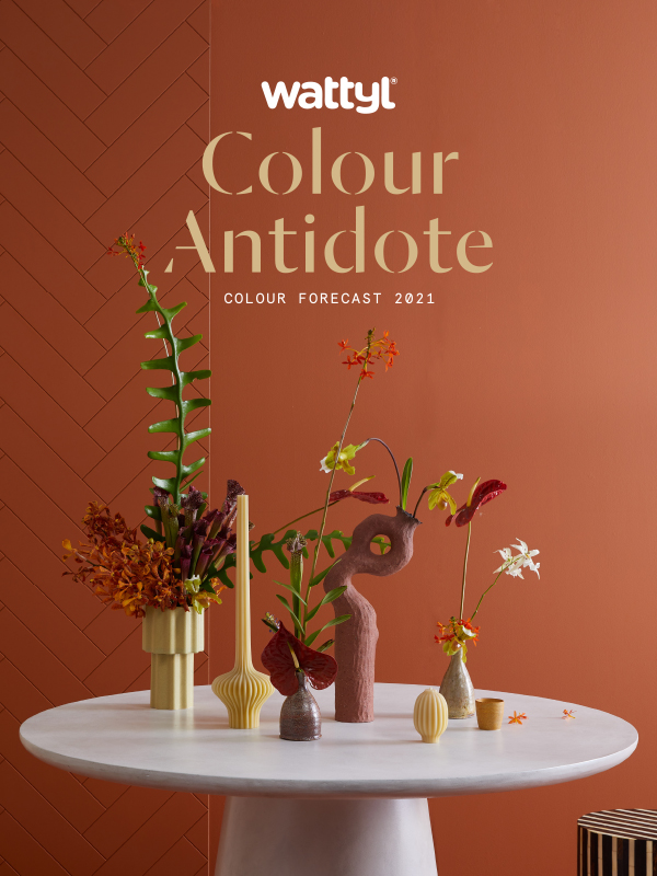
2021 Colour Forecast
24/07/2020
The power of colour to de-stress, nurture and cocoon will be a key antidote to the uncertainties of a post-covid world, according to colour experts across the globe.
Sarah Stephenson, Wattyl’s colour expert, says many of us will satisfy our craving for wellness, happiness and safety by surrounding ourselves with colours that invoke calmness and security, as well as those that forge a stronger connection with nature.
Wattyl has announced its new colour palettes for 2021 – four palettes that deliver an uplifting injection of carefully curated colour that cleverly walks the line between timeless and contemporary. “These palettes, designed with a focus on wellness and nurturing, are for painting on walls, for soft furnishings and other decorative elements, from bedlinen to artworks. Colour really can transform our home into our sanctuary, something most of us are craving,”
said Sarah Stephenson, Wattyl’s Colour and Design Specialist.
The palettes span the spectrum from Optimistic Lights and Nourishing Earth Tones, to Shadowy Darks and Humble Whites.
 CW 152.6
Brandy Snap 
CW 69.5
Moccacino
CW 107.6
Run Forest
NOURISHING EARTH TONES
Natural earth tones will become even more important in a post-Covid-19 world – these warm, nourishing plant-based colours will help us to reconnect with nature and the outdoors. Terracotta tones, such as Brandy Snap, continue to be a much-loved and important element in interiors as they feel timeless, authentic and natural.
This trans-seasonal colour palette sees paler, beige tones being replaced with richer, warmer honey tones and classic neutrals being swapped for mid-tone blues. Greens of 2021 are deep and olive in tone.
Nourishing earth tones will create a mood of warmth and cosiness, at once friendly and organic – something we all crave in these challenging times.
 CW 173.2
Snow Rose
CW 107.1
Light Aqua
CW 37.1
Cave
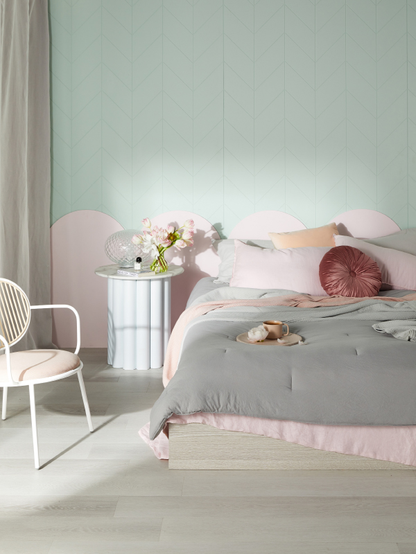
OPTIMISTIC LIGHTS
Pastels, traditionally associated with calm, comfort and a desire for a balance between body and mind, take on new meaning, leaving the sugary tints behind in favour of beautifully dusted pastels that evoke a deeper sense of harmony.
Wattyl’s gentle pales add a warmth and tactility to minimalist spaces, especially when paired with natural silks, organic cottons and soft wools in relaxed forms.
 CW 82.7
Dark Dream
CW 33.7
Black Hole
CW 100.7
Deep Forest
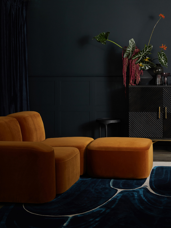
SHADOWY DARKS
The rise of tinted blacks and saturated darks is a direct response to the current mood of fear and anxiety – they have become even more relevant in these post-pandemic times.
These richer, darker hues can feel luxurious and cocooning – the mood is one of timeworn comfort encompassing a classic mix of eras, with an embrace of botanical decorative elements, while ribs and curves feature in architectural details and furniture.
 CW 10.3
Lushious White
CW 68.2
Confetti Shower
CW 63.3
Ice Volcano
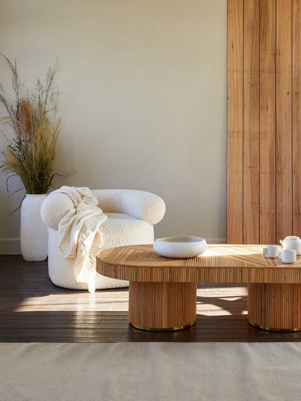
HUMBLE WHITES
Minimalism continues to reign supreme in many homes, but it is warming – it is less pristine in both detail and styling. Personality and emotion are introduced into the mix by virtue of authenticity, craft and history in both design and materials – without any loss of functionality.
Comforting hues, natural materials and softened forms are key to the look, adding a calming and restorative feel to these pared back spaces. The principles of wabi-sabi design – imperfect beauty – add further depth, think artfully worn surfaces and considered imperfections.
Using a limited palette of colour and materials, such as timber, leather and vegetable-dyed textiles creates a mindful ambience, one of simplicity and purity.
The air we breathe in our home-life sanctuary is equally important to our well-being – Wattyl I.D Advanced Ultra Low VOC interior paint far exceeds green-building requirements with less than 1g of VOCs per litre (up to 16 times lower than other ultra-premium brands).
Wattyl I.D Advanced is available in water-based matt, low sheen and satin finishes plus Ceiling White.
Available nationally from Wattyl Paint Centres, Mitre 10, Home, Timber & Hardware and other leading paint specialists, Wattyl I.D Advanced retails from $71.90 for a 4L can.
Go to www.wattyl.com.au for more details.
Articles you may also like
News
25/03/2024
Sweet Treats for Winter Walls
Chocolate, caramel, ganache, mocha, latte, brown sugar – some of our ...
News
13/03/2024
My Autumn/Winter Colour Collection by Neale Whitaker
Wattyl Brand Ambassador and Interior Design Expert, Neale Whitaker shares ...