Colour Dreams

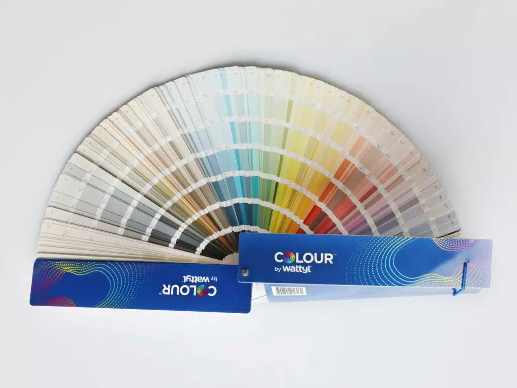
Choosing The Perfect Colour: Wattyl Paint Colour Chart

30/05/2025

Your guide to choosing the perfect colour – from soft whites to bold blues and everything in between.

When it comes to refreshing your home or starting a new project, the right paint colour can transform your space. The Online Wattyl Paint Colour Chart is your go-to guide for discovering rich, curated colours, from calming neutrals to standout feature hues.

With a wide range of inspiring palettes and helpful tools to make choosing simple, Wattyl makes it easy to bring your vision to life.

Explore the Wattyl Colour Range

Whether you’re painting a whole home or just a feature wall, Wattyl has a colour for every space and style. Here’s a look at some of our most loved hues, from soft to saturated:

Whites

Classic, calming and versatile, white paint creates light-filled spaces and works beautifully in both modern and traditional homes.

Wattyl White – a crisp, clean white with a high light reflectance value, making it ideal for brightening interior spaces. Its neutral undertone allows it to complement various colour palettes and design styles.

Other Top Picks:

  • Astor White
  • Flurry

Pro tip: Use whites like Floral White to make smaller rooms feel bigger and brighter.

Neutrals

Neutral paint colours offer the perfect backdrop for layering textures, natural materials, and pops of colour.

Cave – a versatile, neutral grey that brings a sense of calm and sophistication to interiors. This adaptable hue pairs well with a variety of color palettes, making it suitable for both contemporary and classic designs.​

Other Top Picks:

  • Kitty Grey
  • Winter Mushroom

Style tip: Westerly and Arid Land work beautifully in Scandi-style interiors or earthy, Australian home designs.

Greens

Looking to add harmony and freshness? Green paint is a top trend, from sage to avocado.

Cloud – A soft, sophisticated light green with subtle undertones, perfect for creating a modern and inviting space. Its versatile, muted hue pairs beautifully with both warm and cool tones, making it an ideal choice for contemporary interiors.

Other Top Picks:

  • Sage
  • Leaves of Green

Blues

Blue paint brings peace and depth. Use soft blues in bedrooms or deep navies for dramatic accent walls.

Atmospheric – a soft, muted blue that brings a calming and serene ambiance to interiors. This gentle hue is ideal for creating tranquil spaces and pairs well with neutral tones.​

Other Top Picks:

  • Balkan Blue
  • Midnight Seas

Pinks

Pinks aren’t just for nurseries. Think sophisticated blushes and bold corals.

Vintage velvet – a soft, muted pink that evokes the delicate charm of blooming roses. This versatile hue adds a touch of warmth and elegance to any space.​

Other Top Picks:

  • Millennial Pink
  • Flamingo Feather

Hot trend: Soft pinks work beautifully with green accents for a modern botanical vibe.

Oranges

Bring warmth and optimism with orange paint. Perfect for kitchens or creative zones.

Happy Halloween – a vibrant, bold orange that captures the festive spirit of the season. This lively hue adds a playful and energetic touch to any space, making it perfect for accent walls or decorative elements.​

Other Top Picks:

  • Copper Sand
  • Pumpkin Puree

Inspiration: Pair with deep neutrals or navy for a striking contrast.

Yellows

Infuse your home with sunshine using yellow paint.

Barbary Coast – a warm, golden yellow that brings a cheerful and inviting atmosphere to interiors. This vibrant hue adds a touch of sunshine to any space, making it ideal for kitchens and dining areas.​

Other Top Picks:

  • Honey Pot
  • Golden Summer

Inspiration: Soft yellows like Glee are perfect for hallways and family rooms.

Purples

Purple paint is back—with a fresh, contemporary twist.

Vintage Plum – A heritage-inspired purple suited to bedrooms, formal lounges or library spaces. It’s depth provides a cosy, layered look when paired with rich textiles and soft lighting.

Other Top Picks:

  • Poised in Purple
  • Lavender Splash

Style tip: Use muted purples like Vintage Plum for a luxurious, cocooning effect.

Heritage Colours

Discover timeless heritage paint colours inspired by Australian history and architecture.

Top Picks:

  • Heritage Red
  • Mid Earth
  • Warm Beige

Perfect for: Federation homes or country-style interiors.

COLORBOND® Colours

Designed to complement COLORBOND® steel, these COLORBOND® paint colours match popular roofing and exterior finishes.

Nightsky® – A true black from the COLORBOND® range, perfect for external cladding, fences and feature trims. It contrasts well with native landscaping and lighter façades.

Other Top Picks:

  • Dune®
  • Monument®

Tip: Great for exteriors and outdoor entertaining spaces.

Try before you paint

Choosing a paint colour is exciting—but it can be tricky to visualise how a shade will look in your space, lighting, and style. That’s why Wattyl makes it easy to test colours at home before you commit.

Wattyl colour samplers

The Wattyl Colour Sampler range allows you to paint a test patch and see exactly how the colour looks on your wall, in different lighting, and next to your furnishings.

Four levels of colour depth to help you decide:

  • White – 500ml – Ideal for sampling whites, off-whites, and very pale neutrals.
  • Light – 500ml – For testing soft pastels and subtle tones.
  • Mid – 500ml – Great for mid-toned hues, including greens, blues and pinks.
  • Strong – 500ml – Perfect for bold, rich, or dark colours like navy, terracotta, or charcoal.

Why use a colour sampler?

  • See how the paint looks in your natural light
  • Test multiple shades side-by-side
  • Avoid costly mistakes and repainting

Tip: Paint two coats on an A4 board or directly onto the wall. Move the board around the room to see how it reacts to changing light throughout the day.

Wattyl Colour by Wattyl Fandeck

If you’re working across multiple rooms or helping clients choose colours, the Colour by Wattyl Fandeck is a must-have tool.

Perfect for:

Interior designers

Builders and painters

  • Renovators and home stylists

Why you’ll love it:

  • Features all Wattyl colours
  • Convenient, portable and easy to use on-site
  • The closest thing to a full Wattyl paint colour chart in your hands

Order the Fandeck online and start your colour journey with confidence.

Expert colour services

Need help deciding? Wattyl’s expert colour services make it easy.

  • Colour Match – get a perfect match from an existing wall, cushion or fabric.
  • Colour Consultation – book a session with a colour expert for tailored advice.

Trending colour inspiration

Ready to find your colour?

Explore the full Wattyl colour chart, try a colour sampler, or chat with an expert through Wattyl’s colour consultation.

Whether you’re exploring our paint colour charts or looking to test your perfect white paint or sage green feature wall, Wattyl helps you paint with confidence.

Articles you may also like

News 20/03/2025
How To Paint A Front Door

Your front door is one of the first things visitors ...

right arrow
News 20/03/2025
How to Paint Doors, Trims, and Windows for a Professional Finish

Painting doors, trims, and windows can give any room a ...

right arrow
News 20/03/2025
Bring New Life to Your Outdoor Furniture with Wattyl Stains and Oils

Outdoor furniture is exposed to the elements year-round, taking a ...

right arrow

We are here for you, ask us anything

Leave your enquiry and details below, and we’ll get back to you as soon as possible.