Articles
Our homes – painting a different picture post pandemic
31/03/2021
March 18, 2021
Anecdotal evidence, that colour is playing a bigger role in our homes as a result of the pandemic, has been borne out by the most recent figures from leading paint supplier Wattyl.
In its latest figures Wattyl shows there has been a 20 per cent increase in consumer requests for colour – especially richer, warmer, earthier hues.

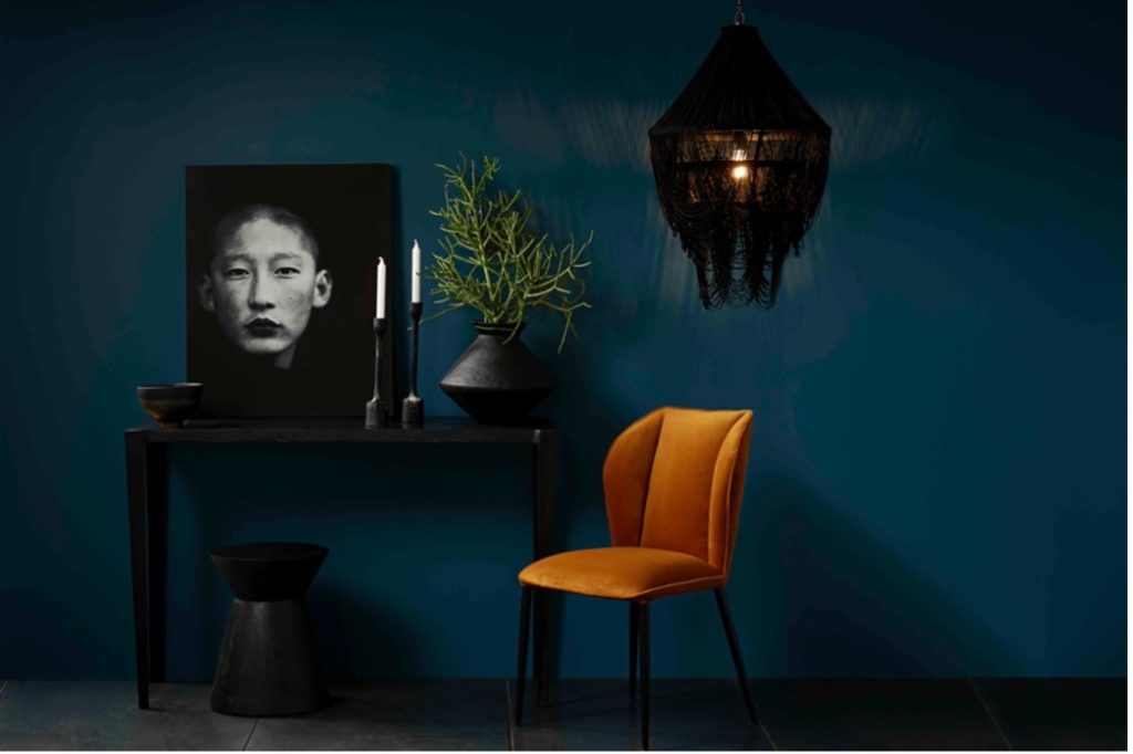
Tibetan Turquoise 
Wattyl Tibetan Turquoise – all furnishings by Horgans, including Amsterdam Console and Kiki Chair
During the long months of lockdowns, with limited access to many services and activities, we were all forced to adapt our homes to both multi-task and offer an antidote to the anxiety and uncertainty we were all experiencing. Another factor in the adaptation of our living spaces was to create areas within areas – separating living areas into schooling and play areas for example, or bedrooms into sleeping and working zones.
This is where paint proved to be the magic ingredient! Not only is it a fast and inexpensive way of giving our homes a fresh, colourful makeover it was also used to cleverly delineate different areas within a larger space. Wattyl’s research confirms the growth in the consumer-led embrace of colour with its latest figures revealing a significant 20 per cent increase!
Our choice of colour also changed during the pandemic with by far the most popular hues being the warmer, earthier colours from mid to deep greens plus rich sun-baked russets and terracottas, warm ochres and buffs.

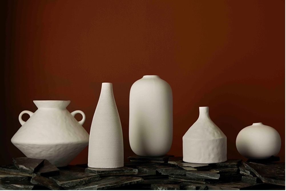
Brandy Snap 
Wattyl Brandy Snap – all vases from Horgans (Cato, Aki, Taro and Imani)
Relaxing/chilling areas, for reading and streaming for example, can benefit from deeper, richer hues that create an ambience of nurturing and cocooning – check out the deep sea greens of Wattyl Tibetan Turquoise or the golden earthy hue of Wattyl Brandy Snap.
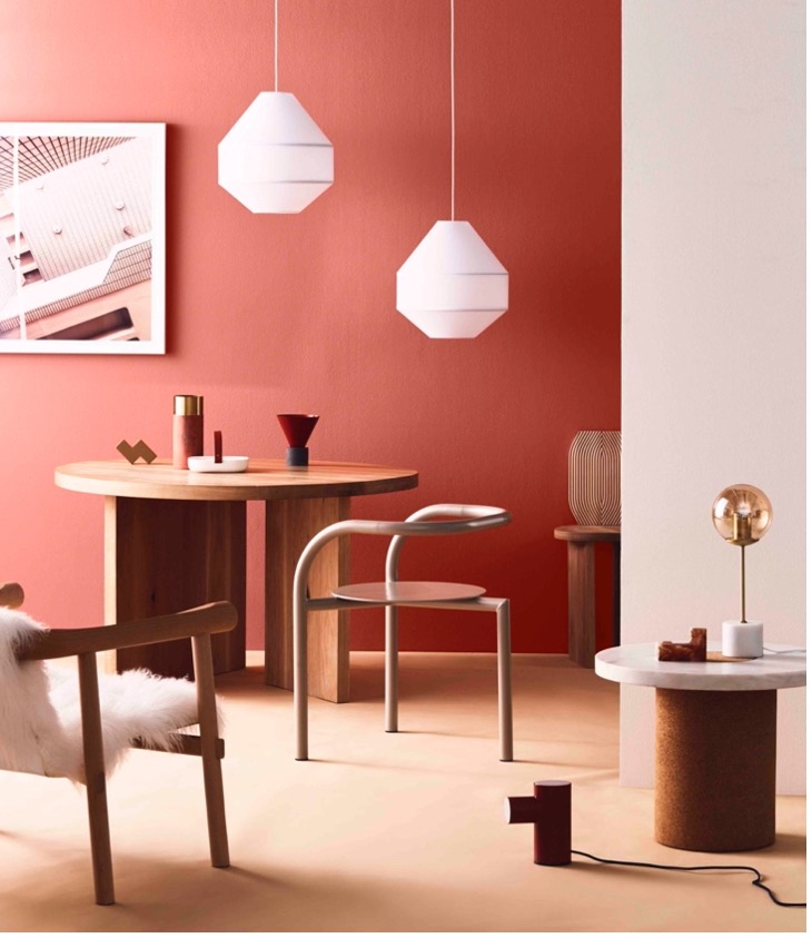
Dining and working areas require a sense of confidence and optimism while maintaining an ambience of grounding and nourishment – warm, mid-tone
russets, sun-kissed ochres and raw brick hues are the perfect fit and work well with lighter neutrals and warm whites.

Brick Dust 
Wattyl Brick Dust
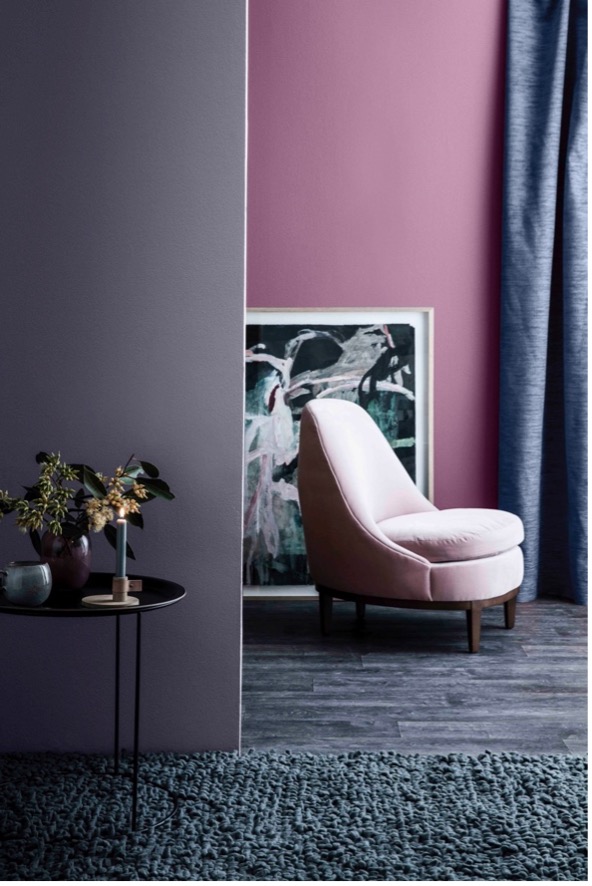
And when it comes to bedrooms – that can often double as home workspaces – the key is to create a calming, thoughtful sanctuary. Blues and lavenders are the perfect fit and work particularly well when used tone on tone or in a layered effect.
Wattyl Imperium and Wattyl Maharajah are two favourites and work equally well together as alone. Other soft furnishings within the room can be selected with varying tonal values from this same area of the colour spectrum and the result will be an exceptionally nurturing sanctuary.

Imperium 
Wattyl Imperium and Maharajah
The other essential factor in creating a safe and nurturing living space is to ensure the level of toxins – in particular VOCs (volatile organic compounds) – is at an absolute minimum. Wattyl has taken the lead in safe paint finishes with its I.D Advanced ultra-low VOC formula with less than 1g of VOCs per litre – a level that far exceeds green-building requirements. Most other ultra-premium brands contain VOC levels up to sixteen times that of I.D Advanced.
Wattyl I.D Advanced interior paint formula is available in water-based matt, low sheen and satin finishes plus Ceiling White.
Go to www.wattyl.com.au for more details.
Horgans furniture and homewares www.horgans.com.au
Articles you may also like
Vacant suites, retail refits and healthcare refreshes all share the ...

Choosing the right sheen is equal parts finish , function and ...

Spring in Australia (September–November) is the season of longer ...


