Articles

The Colourful Friends of Cloud Dancer

13/03/2026

The billowy whites and barely-there neutrals of Cloud Dancer are only part of the Pantone Colour of the Year 2026 story. It’s Pantone’s palette of Powdered Pastels and softened, shadowy hues (designed to work with Cloud Dancer) that creates the visual interest, the sense of mood and personal expression that the lofty white of Cloud Dancer allows to shine.


These beautiful, subtle Pantone hues are ideally suited to Australian interiors, given our much harsher light and our unique architecture. Below are a series of interiors featuring some of these pastel combinations in Wattyl colour matches, alongside Wattyl’s interpretations of Cloud Dancer.


The living space below, part of an open-plan design drenched in natural light, courtesy of double-height expanses of glass, is an oasis of calm thanks to the choice of Wattyl Calcium for all walls. Any hint of blandness is well and truly banished courtesy of pops of pastel playfulness – blues, peach and lilac – in the form of artwork, cabinetry and fresh flowers.
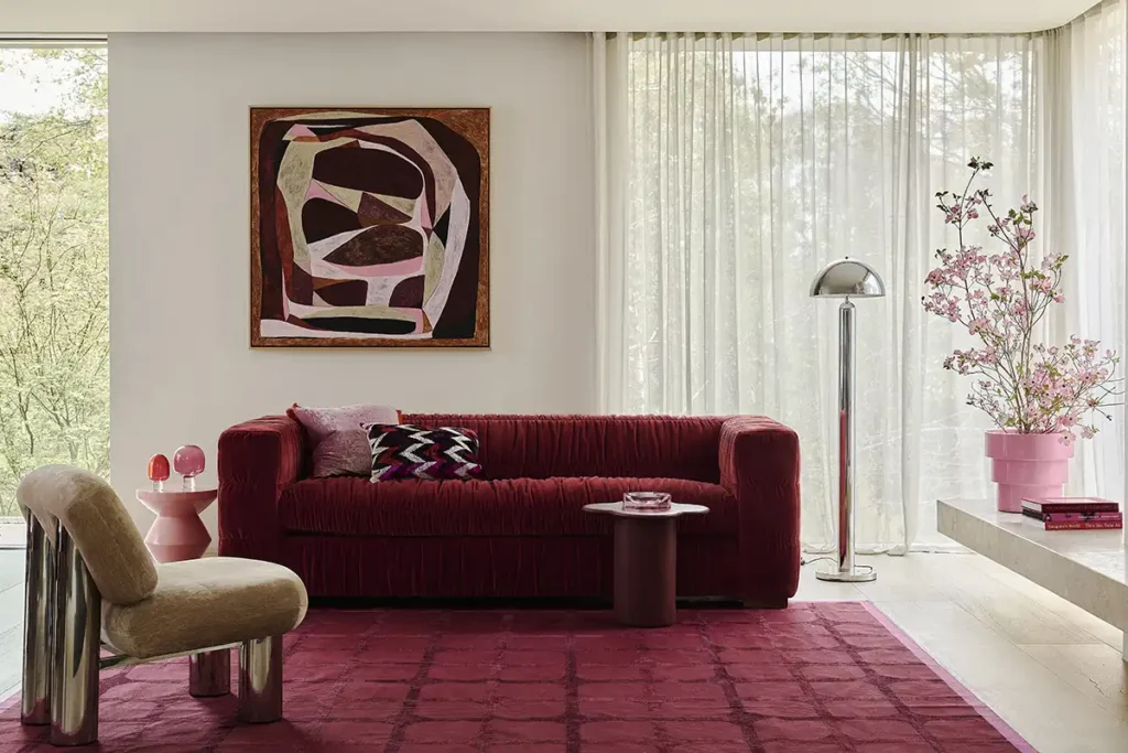
And in the scenario below, the combination of Wattyl Purest White on the walls and ceiling, with a balanced infusion of pastel pink and the nuanced peach of the chair, is a clever way of creating an ambience of luxury and elegance, along with a subtle sense of playfulness.
The living space below illustrates how this clever palette of lofty whites and powdered pastels can be used to create a raft of interior styles, that are both individual and utterly liveable. There are virtually no rules, simply choose a nuanced white for walls and ceiling and then play with colour on the decorative elements. The combination of Wattyl Halo White with soft lilacs and muted golds (below) is a palette that is both nurturing and inspiring.
The 2026 colour palette of Cloud Dancer whites and powdered pastels is equally as effective for exteriors – as can be seen below. Warm whites on the walls – Wattyl Whiteweave – along with blonde timber cladding above and organic stone paving is the perfect setting for a powder blue dining setting. It’s fresh and inviting, yet timeless in its appeal.


So, far from boring, as some have described the Pantone Colour of the Year 2026, this new palette is one for Australians – it’s inspiring and can well be the solution to many renovators’ colour dilemmas! Check out the Wattyl colour page on its website – https://www.wattyl.com.au/shop/colours/ – or visit a Wattyl paint centre for further inspiration.
* All images courtesy Fenton & Fenton https://www.fentonandfenton.com.au/

Articles you may also like

News 30/04/2026
How to Paint a Bathroom Ceiling to Prevent Mould

Bathroom ceiling mould is one of the most frustrating problems ...

right arrow

We are here for you, ask us anything

Leave your enquiry and details below, and we’ll get back to you as soon as possible.