Articles

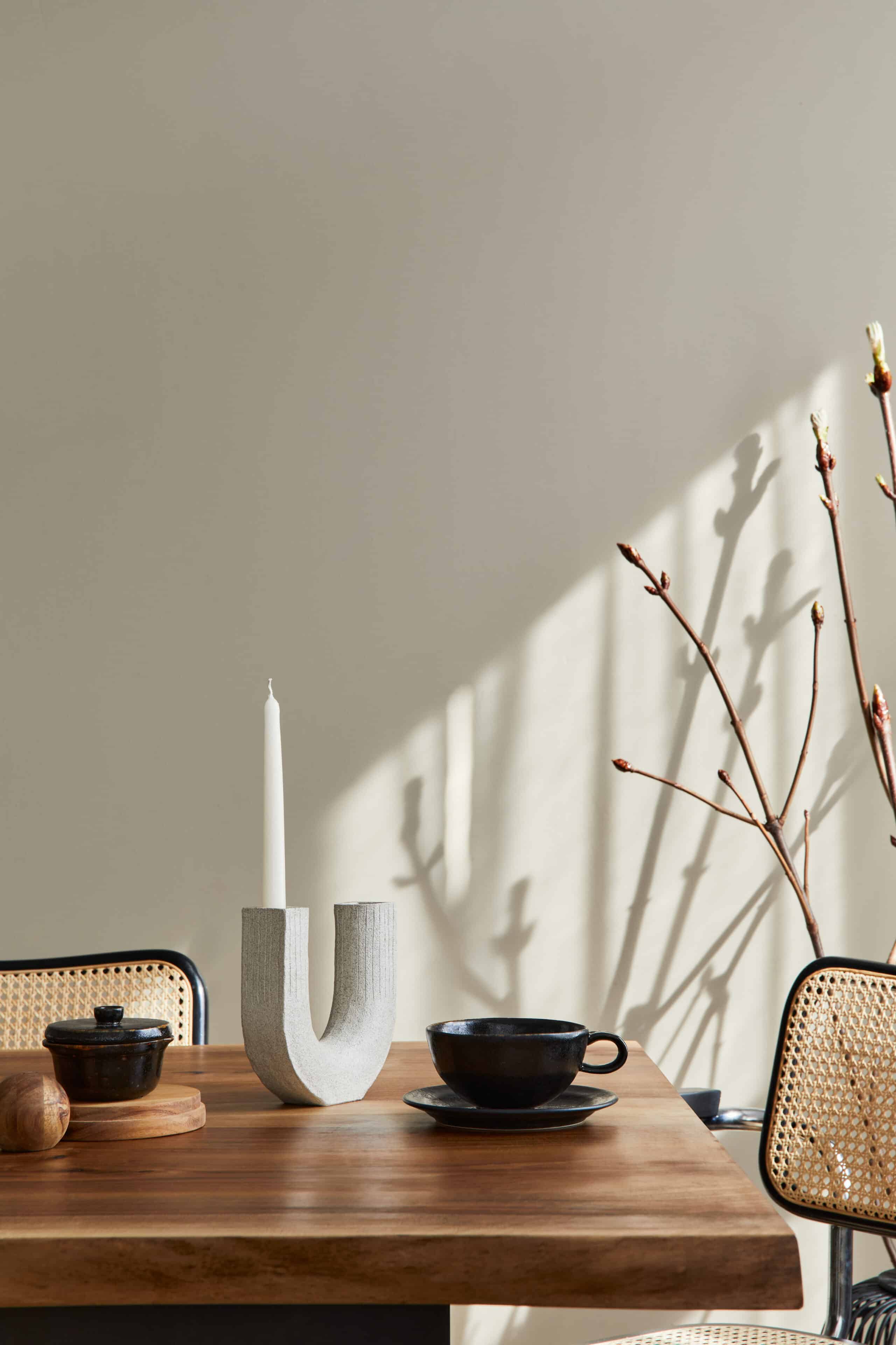
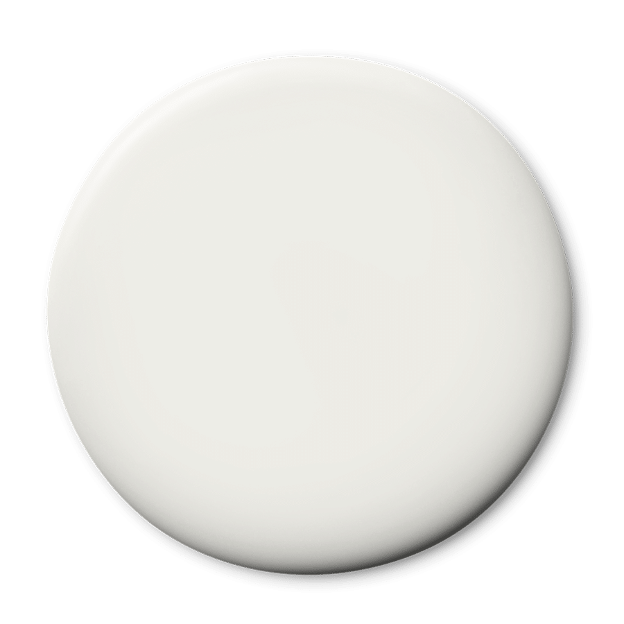
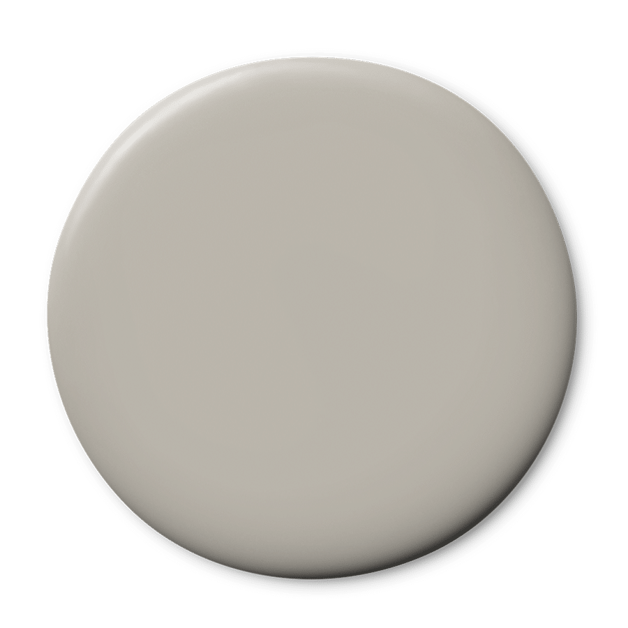
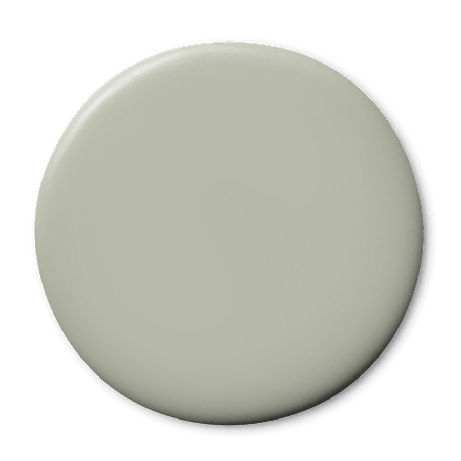
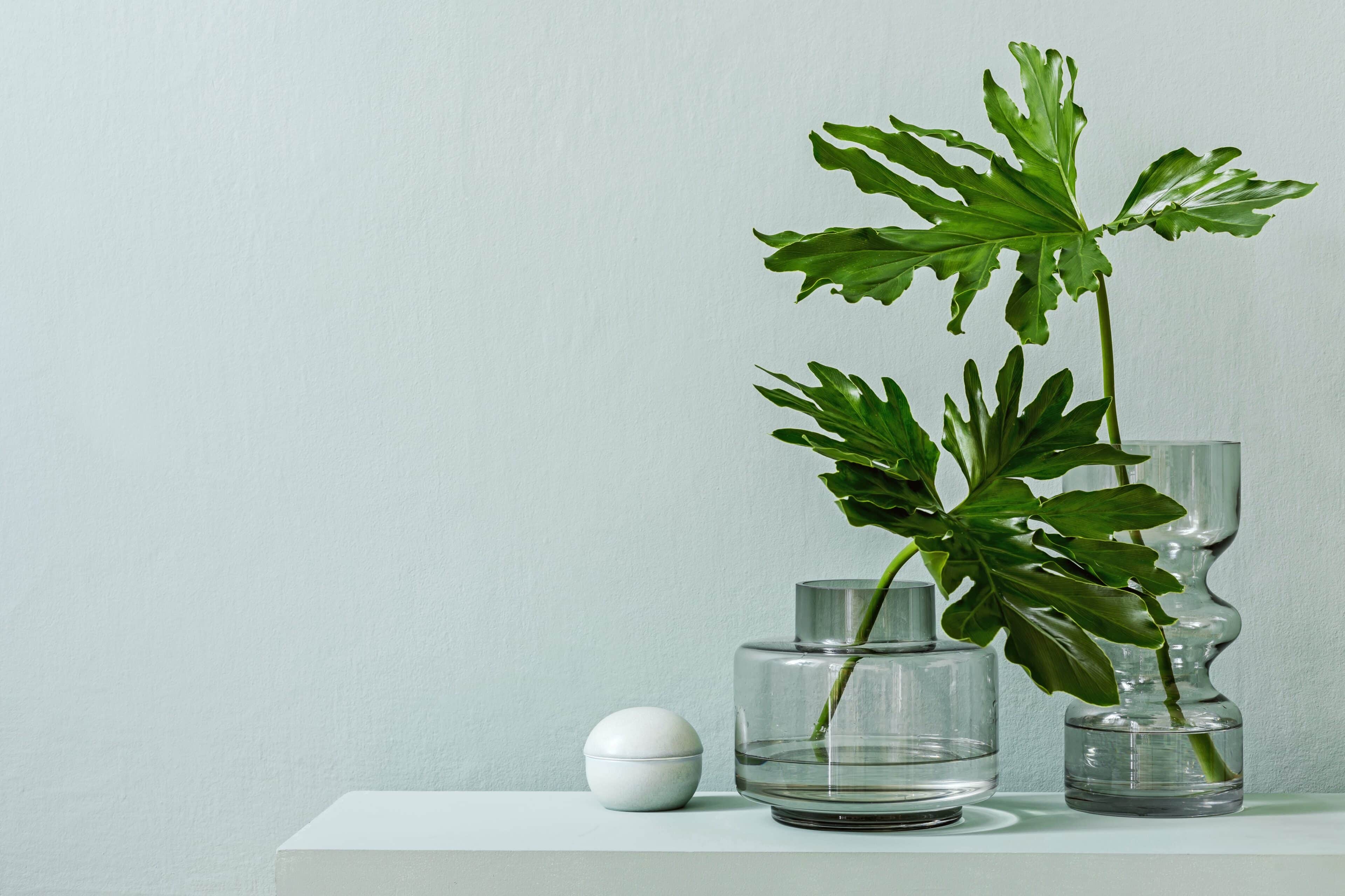
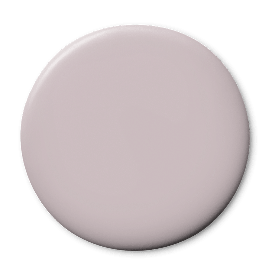
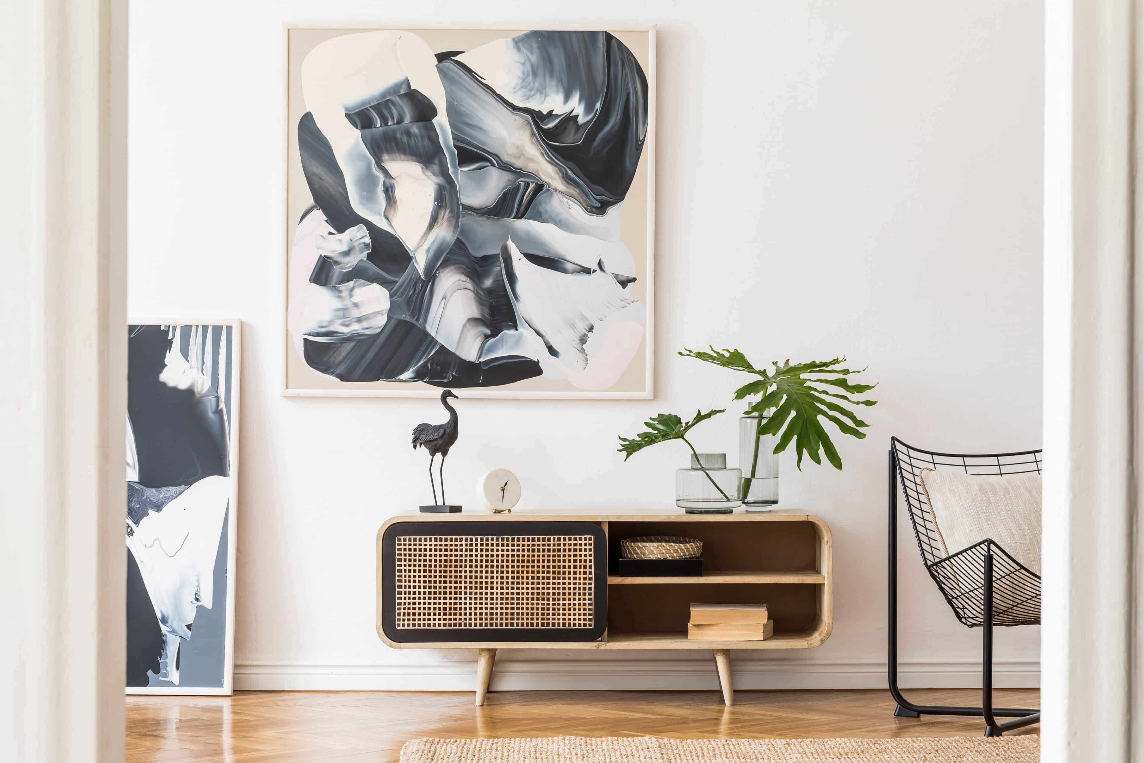
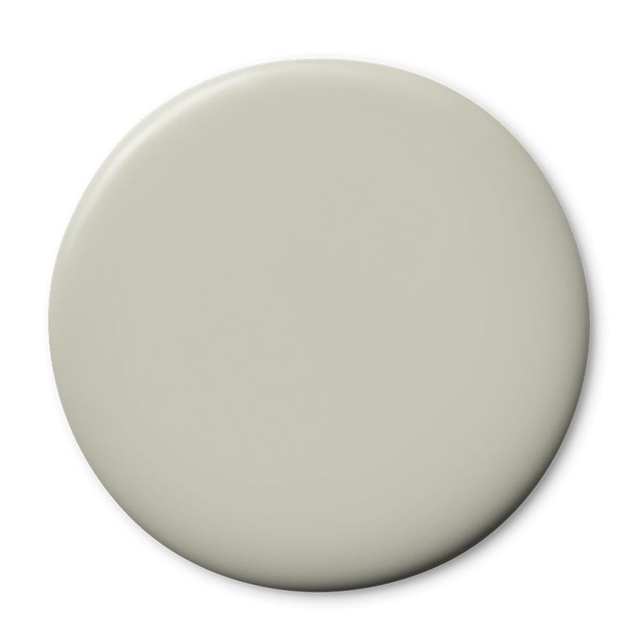
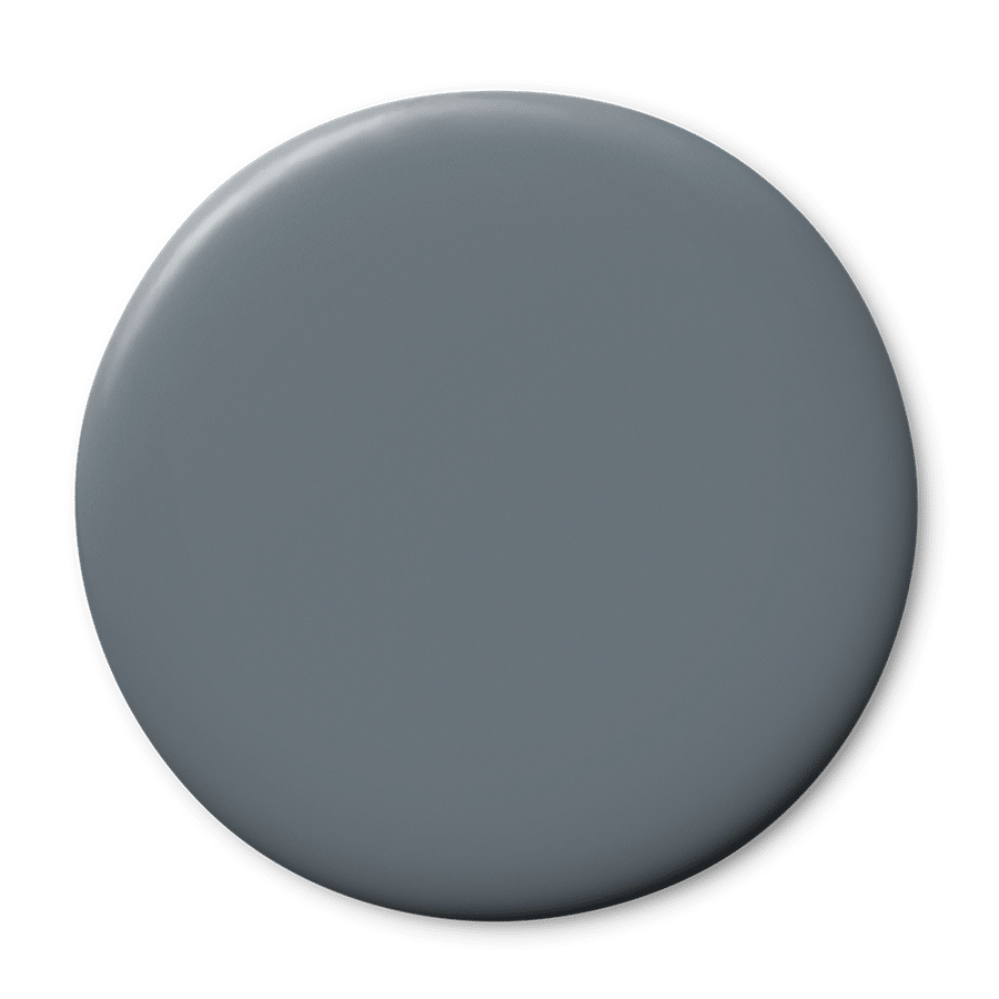
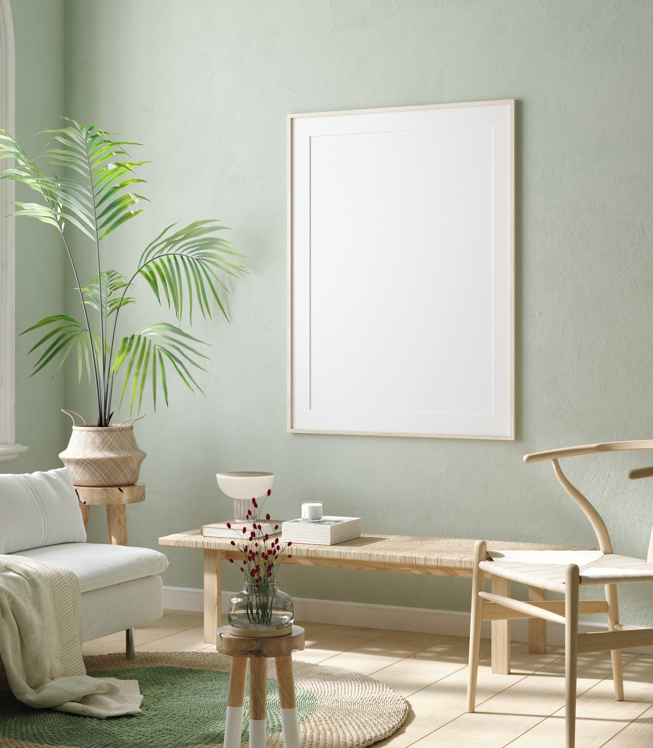
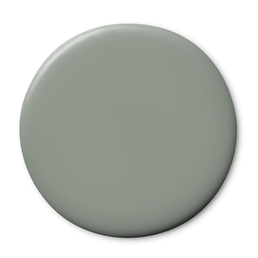
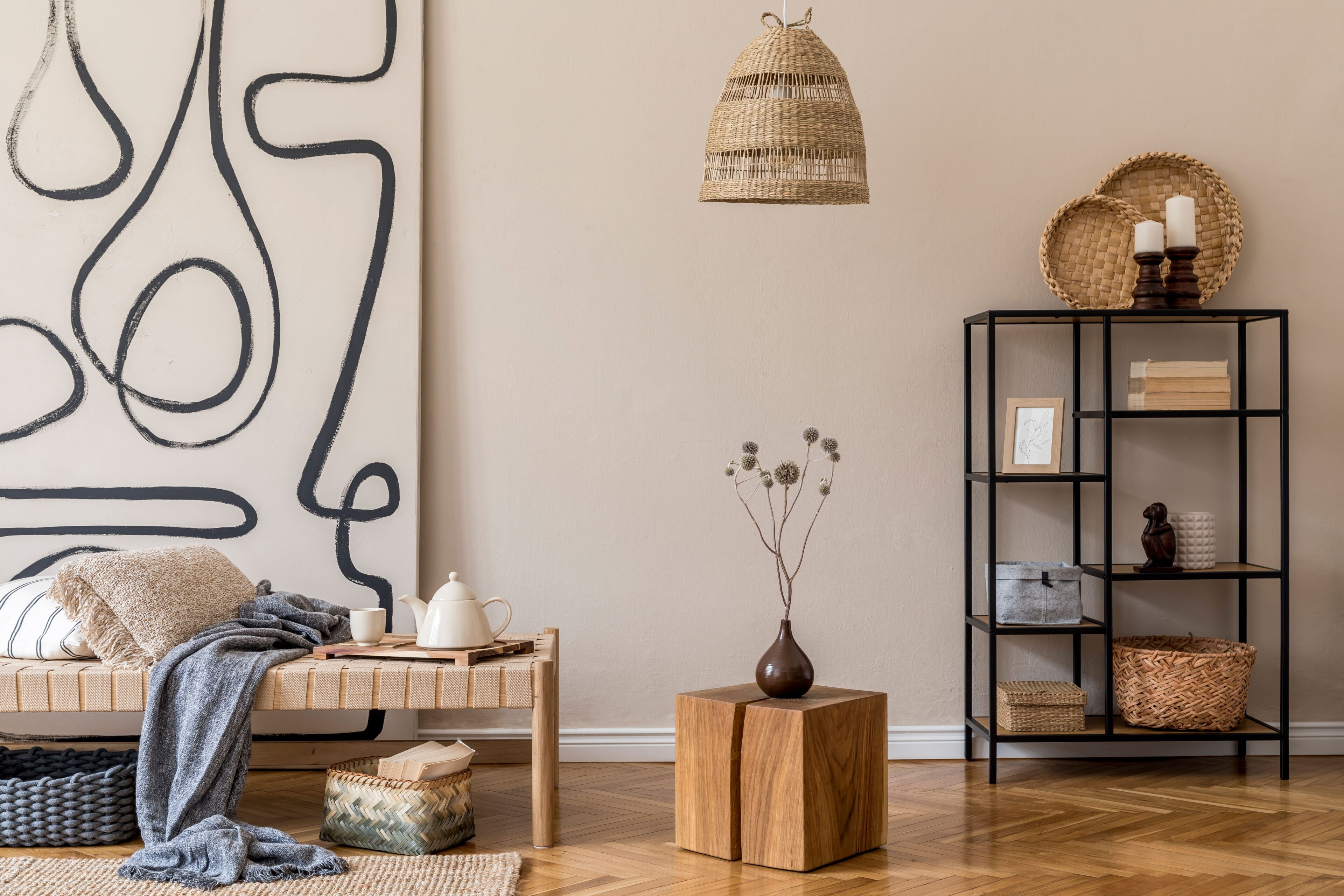
The Five Most Timeless Colours

12/06/2024

In a world where trends come and go, the question we’re often asked, is what are the most timeless colours for Australian homes – who are the quiet heroes of the interior space?

It may be surprising, but white – pure white – is not the answer!  It’s often too cold and too stark.  Rather, it’s a combination of barely-there neutrals that are each grounded in nature, subtly connected to the earth. These colours mimic those found in the natural landscape, they shift in tone ever so slightly, depending on the natural light, the time of day, the season, and also the weather. 


Timelessness-in-a-can, can be summed up in the following five paint colours:


1. KITTY GREY

Wattyl Kitty Grey, the chameleon.  An easy neutral, not too warm, not too cool, that will reflect and accentuate the natural light within a room.  One moment Kitty Grey will appear as a creamy white, and the next it becomes the softest, palest grey.

Pair with Calcium for a crisp white trim or layer with Toned Taupe for a calming yet modern and sophisticated feel. For a bedroom space, Kitty grey works well with Serenity.

This pale, duck egg blue – Wattyl Sydney Mist – is both crystalline and calm, reflecting the slightly greyed-off blue of winter skies.  It can change from a stone blue to a soft grey-blue.

For a classic coastal palette, pair with popular cool white – Breeze. If you’re looking to add tonal depth to a space with Sydney Mist, try a feature wall in Stone Washed, perfect for rooms that receive a lot of natural, north or western light. To create a calming and tranquil bedroom space pair with Nocturnal.


A versatile white that has a hint of grey and works well as a neutral backdrop to artwork and furnishings.  Wattyl City Path is a favourite for the minimaluxe style of interior.

City Path works well as a trim colour for interior walls in Providence, creating a timeless modern country look. The beautifully dusky tone of Smoke Sauna paired with City Path will bring a welcoming warmth, ideal for living spaces. For those after a little more drama, try using Penumbra for a feature wall or dining room space to add a bold sense of sophistication.


4. WESTERLY

A soft, faded green that exudes tranquillity and serenity, Wattyl Westerly is a muted green that creates a neutral balance within a room, neither too warm nor too cool, creating a versatile backdrop for most interior styles.

Create a coastal cool, interior feel with Wattyl Westerly for the walls and Stalactite for the trim. For a soothing tonal palette, pair with Sea Mineral, and if a new look, harmonious vibe is what you’re after, try a combination of Westerly and Cherry Haze.


5. ARID LAND

With its roots firmly in nature, Wattyl Arid Land is an earthy neutral that brings warmth to south facing rooms in the cooler months.  It’s a colour that goes with virtually any style of architecture and décor.

Pair Arid Land with Wattyl Grain of Sand to create a look that aligns with the ‘Quiet Luxury’ trend – a restrained, pared back style with a touch of quiet luxury. Or invigorate your senses and enhance the warmth of Arid Land with a touch of Fireball Glow. If you prefer a fresh and contemporary feel, pair with Crag Grey.


Each of these colours creates the perfect canvas for an ever-changing mix of soft furnishings, rugs, throws, artwork and decorative elements.  While never taking centre stage, they will provide understated intrigue in the form of subtle shifts in hue as the light changes, the season moves on.


All paint colours are affected by light, both natural and electric, as well as existing decorative materials such as floorboards, rugs and carpets.  For this reason Wattyl recommends testing the colour, on swatches, within the room, over a period of days.  Sample pots can be purchased instore and online.


Visit your local Wattyl Paint Centre for everything you need from paints and stains to accessories and more!

Find your local stockist

Articles you may also like

News 05/09/2024
Deep Red Renaissance

BURGUNDY, MAROON SPICE, RICH RUSSET… REDS ARE BACK! The renaissance ...

right arrow
News 15/05/2024
Creating a sense of home, and why it won't happen overnight..

The Slow Decor Movement Neale Whitaker  Wattyl Brand Ambassador and ...

right arrow
News 01/05/2024
The Urban Aunt Trend Explained

UNCOVERING THE LATEST TRENDS TO HIT  INTERIOR DECOR AND DESIGN ...

right arrow

We are here for you, ask us anything

Leave your enquiry and details below, and we’ll get back to you as soon as possible.